
Reading Your Dashboard
Your dashboard answers one question: is my website working for me? You don’t need to be technical to read it. This page walks you through what each number means and which ones are worth your attention.
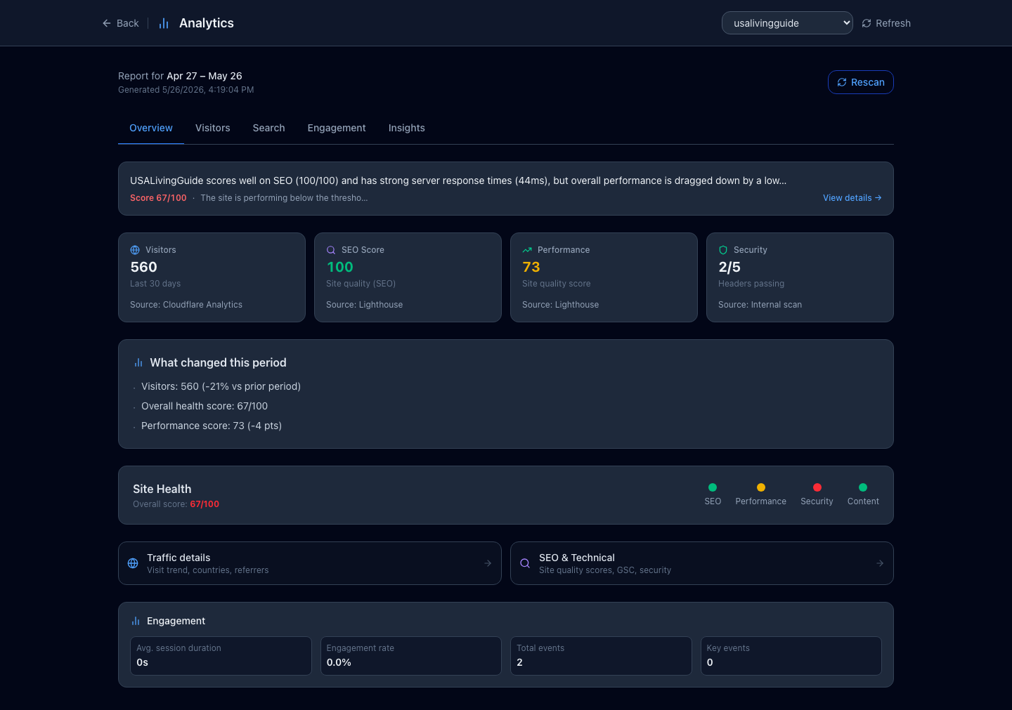
#The four numbers at the top
When you open your dashboard, four tiles sit across the top. Here’s what each one is telling you.
- Visitors — how many people came to your site in the last 30 days. This is the headline number: more visitors usually means more customers finding you.
- SEO — a score out of 100 for how well search engines like Google can read your site. Higher is better. Above 90 is excellent; below 70 means there’s room to improve.
- Performance — a score out of 100 for how fast your site loads. Slow sites lose visitors before the page even appears, so this one matters more than it looks.
- Security — shows how many of five standard safety checks your site passes (for example, “4/5”). These protect your visitors and help your search ranking.
#What changed this week
Below the tiles is a short summary of what moved since last time — “Visitors up 12%,” “SEO score now 95.” It’s the fastest way to see whether things are heading the right direction without reading every number.
If you just started, this section may say there’s no history yet. That’s normal — it fills in once we’ve gathered a couple of weeks of data.
#Looking deeper
The dashboard has tabs across the top for when you want more detail:
- Visitors — where your visitors come from (which countries), what devices they use (phone vs. computer), and how that’s trending over time.
- Search — the technical SEO and performance detail behind the scores up top.
- Engagement — which pages people actually look at and how long they stay. This needs Google Analytics connected first (see Connecting Google Analytics).
#The health score and your to-do list
Near the top you’ll see an overall health score out of 100 and a colored set of dots. Think of it like a check-up: green is healthy, yellow needs attention, red needs a fix.
Underneath, the AI lists specific things you could improve — a missing page description, a slow image, a broken link. Each one is something concrete, not jargon. You can ask the AI to fix many of them in chat, which we cover in Acting on AI Recommendations.
#Where the numbers come from
You’ll see small captions like “Cloudflare RUM” or “Lighthouse” under some tiles. Those are just the trusted, independent tools we use to measure your site — you don’t need to know them. They’re there so the numbers are honest, not guesses.